|
About gNumerator
|
General Info
|
|
Plans and Progress
|
|
About MathML
|
|
SourceForge Project Page for gNumerator
|
|
Updates / News / Blog
|
Blog, Updated January 26, 2005
|
Downloads, release 0.34,
Feburary 13, 2005
|
Release Notes for version 0.34
|
MathML Control, MathML DOM, Test App, and Documentation
|
Source Code
|
|
Contact
|
|
endre-somogyi@comcast.net
|
gNumerator Mailing List
|
|
Need an experienced computer scientist?
|
My Resume / CV
|
|
Anonymous Feedback
|
Anonymous Feature Requests
Anonymous Bug Reports
|
|
Articles
|
Extending the DOM
Fast parsing of XML entities
Calling C methods from C#
The visitor pattern
|
|
Documentation
|
|
Components
|
MathML DOM
MathML Rendering Control
|
|
Screenshots
|
First Rendering of MathML
|
A slightly more complex example
|
Same example, with almost correct use of stretchy characters
|
|
Stretchy operators are finally working correctly
|
|
SubScripts and SuperScripts are now working, also a comparison with Mozilla
|
|
Radicals are now working, and a comparison with Microsoft Word
|
|
Radical Indices, and sub and super scirpt elements
|
|
Under and Over Elements, and Horisontal Stretchy Operators
|
|
Complex Tables
|
|
Browse Source Repository
|
MathML Document Object Model
|
MathML Rendering Control
|
|
|
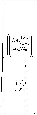
Square Root elements are now working! This includes <msqrt>, and
<mroot>elements. I used the CMEX10 (computer modern math extension) font
for the square root glyphs. The nice thing is that this font provides many glyphs for this
character, and each glyph is angled slightly differently, so they look good with various
sized radicands. Also, this font provides a true stretchy glyph for radicals that must
stretch to very large sizes. Notice how using differnt glyphs produces much better results
than Microsoft Word (screenshot at bottom) which only used the Windows font mapper to
stretch a single square root glyph to different sizes.
A note about fonts: Most glyphs are rendered from the standard "times new roman" and "symbol"
fonts, as they come installed in all Windows systems. I currently use the TeX CMEX10 font for
radical glyphs, and probably will use it for more glyphs in the future, as this font is the
only freely availible font that can produce these glyphs properly. The Mathematica
fonts also produce these glyphs, but
they are not freely available, or at least I am not legally allowed to redistibute them.
All glyphs mapping (in the rendering widget) is handled via a set of config files. Each config file (standard xml) is
for a single font, so currently, I have "font-configuration-times.xml", "font-configuration-symbol.xml",
and "font-configuration-cmex.xml". The rendering widget enumerates the contents of the config
directoy at startup time, and all font config files are loaded. I probably will create a
config file for the Mathematica fonts, and if a user wants to, they can download this font,
and the rendering widget will automaticlly load it. Note, the Mathematica fonts do produce
better looking glyhps than the TeX computer modern font.
source mathml for this screenshot
 (above) A screenshot of the MathML rendering control showing square roots, and stretchy integral
operators. Notice the
different sized glyphs for the square root symbols, as they encompass different sized radicands. Also, notice
how the integral operators stretch properly to the height of the row that they are in. I use the standard
symbol.ttf font for the integrals and parentheses, as it provides good multi-part glyphs for these, and I
use the CMEX10.ttf font for the radicals. The other big difference in this rendering, and the
Word equation editor (below), and the Mozilla rendering of MathML is
that the gNumerator MathML rendering widget produces much better, tighter fitting renderings. This is
because it uses the Padovani area fitting algorithm to
do the fitting and layout.
(above) A screenshot of the MathML rendering control showing square roots, and stretchy integral
operators. Notice the
different sized glyphs for the square root symbols, as they encompass different sized radicands. Also, notice
how the integral operators stretch properly to the height of the row that they are in. I use the standard
symbol.ttf font for the integrals and parentheses, as it provides good multi-part glyphs for these, and I
use the CMEX10.ttf font for the radicals. The other big difference in this rendering, and the
Word equation editor (below), and the Mozilla rendering of MathML is
that the gNumerator MathML rendering widget produces much better, tighter fitting renderings. This is
because it uses the Padovani area fitting algorithm to
do the fitting and layout.
 (above) A screenshot from Microsoft Word's equation editor. This is not the same MathML as the
previous example, as Word's equation editor can not do mathml, it has some proprietary data
format. Notice how poorly the radical glyphs 'stretch'. This is because they are using a single
glyph for the radical, and using the Windows font mapper to 'stretch' it. I originally played
around with this technique, but abandoned it very soon, as I produced
extremly poor looking glyphs.
(above) A screenshot from Microsoft Word's equation editor. This is not the same MathML as the
previous example, as Word's equation editor can not do mathml, it has some proprietary data
format. Notice how poorly the radical glyphs 'stretch'. This is because they are using a single
glyph for the radical, and using the Windows font mapper to 'stretch' it. I originally played
around with this technique, but abandoned it very soon, as I produced
extremly poor looking glyphs.
|